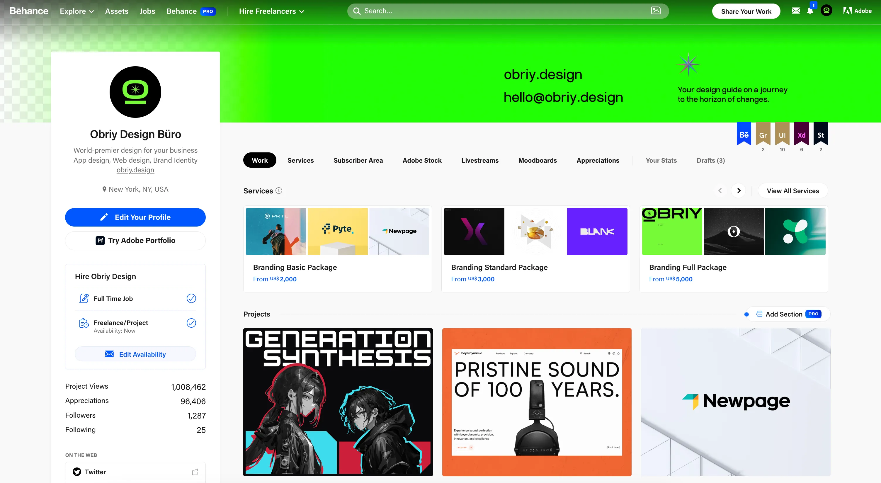
After more than 8 years of work as a design vendor in various business fields and being part of the Behance community, we going to share an experience to build catchy and high-quality Behance cases.
All the advice and insights provided here are based on Obriy Design Büro’s own experience in working on Behance projects.
Clearly define the problem and structure of your case
Screenshots of a website or app mockup without explanations are not a comprehensive UX/UI Behance case project. A good case includes the problem, the paths taken to solve it, and the achieved outcomes. Show the result of your work. Potential employers or clients need to observe the outcomes, the carefully considered core of the project, and your strategy for tackling the assigned tasks.
How to define the problem of your design? It’s quite simple: based on your challenges as a designer. For example, redesigning, creating UX and UI from scratch, etc.
Before beginning your work, outline the structure of your case as a plan. Capture each key stage. This will help ensure that nothing important is overlooked.
At Obriy Design Büro, case creation begins with onboarding. A designer presents a comprehensive overview of the project, highlighting its key features and design elements to the marketing manager and the designer tasked with creating a case study. The next step after onboarding is to create of the structure.
A structure that suits most UX/UI Behance case studies:
1. Introduction:
– Provide an introduction to the project and the tasks assigned to the designers.
– Optionally, briefly list the stages involved in working on the website/app.
2. Key Stages:
– Detail each key stage of the project, including:
– UX Research: Describe the research methods used and the insights gained from user analysis and market research.
– Wireframing: Show wireframes and explain their role in design development.
– UI Concepts: Present the design concepts and ideas considered during the project.
– Final UI: Showcase the final UI screens and explain design choices.
3. Typography and Colors
Highlight the fonts and colors used in the design, along with their significance in achieving the desired user experience.
4. Conclusion:
– Summarize the project’s essence and its successful outcomes.
– Include your contact information for further inquiries.
By adhering to this plan, your case study will effectively convey the essence of the project, the process of its development, and the achieved results, allowing others to appreciate the quality and thoughtfulness of your work.
The plan may change according to the project’s scope, complexity, and the presence of different work stages. We highly recommend working on the introduction and UI. The introduction should clearly outline the problem and the essence of the project. Also, define the screens that need to be shown in the case to demonstrate the solving of the problems presented in the introduction.
Keep your design clean, avoid chaos
In the design of blocks, simplicity and minimalism reign supreme. Avoid unnecessary details and distracting decorations, as they can spoil even the best concepts. Particularly in the intro part, overwhelming decor often reveals a beginner’s touch. Use a clean and organized layout with readable text to convey a professional appearance and showcase your design in the best light.

Aim for a harmonious and cohesive look by utilizing a grid. Ensure that all screens, descriptions, and elements align seamlessly and do not appear chaotic. Remember, less is often more, so keep your design focused and let it speak for itself without unnecessary distractions.

Don’t show the entire design on the first screens of the case
Our designers use storytelling. It means to take your design and gradually reveal your website or app with images, composition and text. If you show the most interesting and valuable at the beginning, the user will not scroll to the final of the case and will not leave a comment.

Use the text and explain your moves and solutions
You did the structure, defined the idea, you chose the screens. The next step is to construct the case in Figma as you do it in your usual design work routine. But don’t forget about a text. The text helps to explain the way of your thoughts. But the text should not distract attention from the main thing — your design. UX/UI case is mostly about visuals; the main hero of your future work will be UI.
Strive for a balanced use of text and avoid consecutive blocks to maintain a clean design. Let the text complement your work without overpowering it. Stay concise and keep the focus on your design. The text should serve as a supportive tool, not the center of attention. Stay concise and let your design work shine.
A cover is the face of your Behance project
A great cover increases the chances that a user will click on your UX/UI case. From a design perspective, they shouldn’t be overly designed but should reflect the essence of the concept. We don’t recommend putting the entire design on the cover, as it may become less interesting to look at. It’s cool when your profile’s grid of project covers looks harmonious and conceptually connected.

Choose Quality Over Quantity
Relevance is a crucial aspect. It’s best to hide projects that have become outdated or no longer align with your current skills. Your design portfolio should showcase your present expertise and understanding of current design trends. The same principle applies to projects from different fields. For example, if you are pursuing a UX/UI designer position but previously worked as an illustrator and are now transitioning to UX/UI, it’s advisable to hide older projects as well. Unless, of course, you are a multidisciplinary designer seeking an appropriate position.
A little more design advice
– Lengthy Behance projects might not hold the attention of many viewers until the end, while overly brief ones may not effectively demonstrate your skills. Aim for a balanced approach.
– When you work with the Behance constructor, download your case into sections rather than one continuous image. This way, it’s easier to make adjustments, and the final project loads faster on devices.
– A modern and trendy design on your Behance project indicates that you are evolving and, at the very least, aware of current trends. This is always a plus. So, keep an eye on the latest tendencies to create contemporary and trendsetting projects on Behance.
– Include your contact information at the end for easy and quick communication.
All examples are based on projects from Obriy Design Büro company profile on Behance.


