A web application is software hosted on a server that users access through their browser. The client (user interface and client‑side logic) runs in the browser, while the server processes requests, manages data and returns results. Because of this architecture, web apps can be accessed from any device with a browser and an internet connection.
They allow users to log in, create or edit content, conduct transactions and even work offline. Understanding the distinction between a web app and a website is important for businesses because the choice affects the architecture, user experience (UX) and long‑term business strategy.
At Obriy Design Büro, we design web apps that scale, simplify complexity, and feel effortless to use. Our focus is to make products intuitive for people and effective for business.
The following five projects showcase how thoughtful UI and UX design turn digital platforms — from fintech to SaaS and crypto — into experiences that users return to. Each interface reflects a visual language that was built for performance and effectiveness.
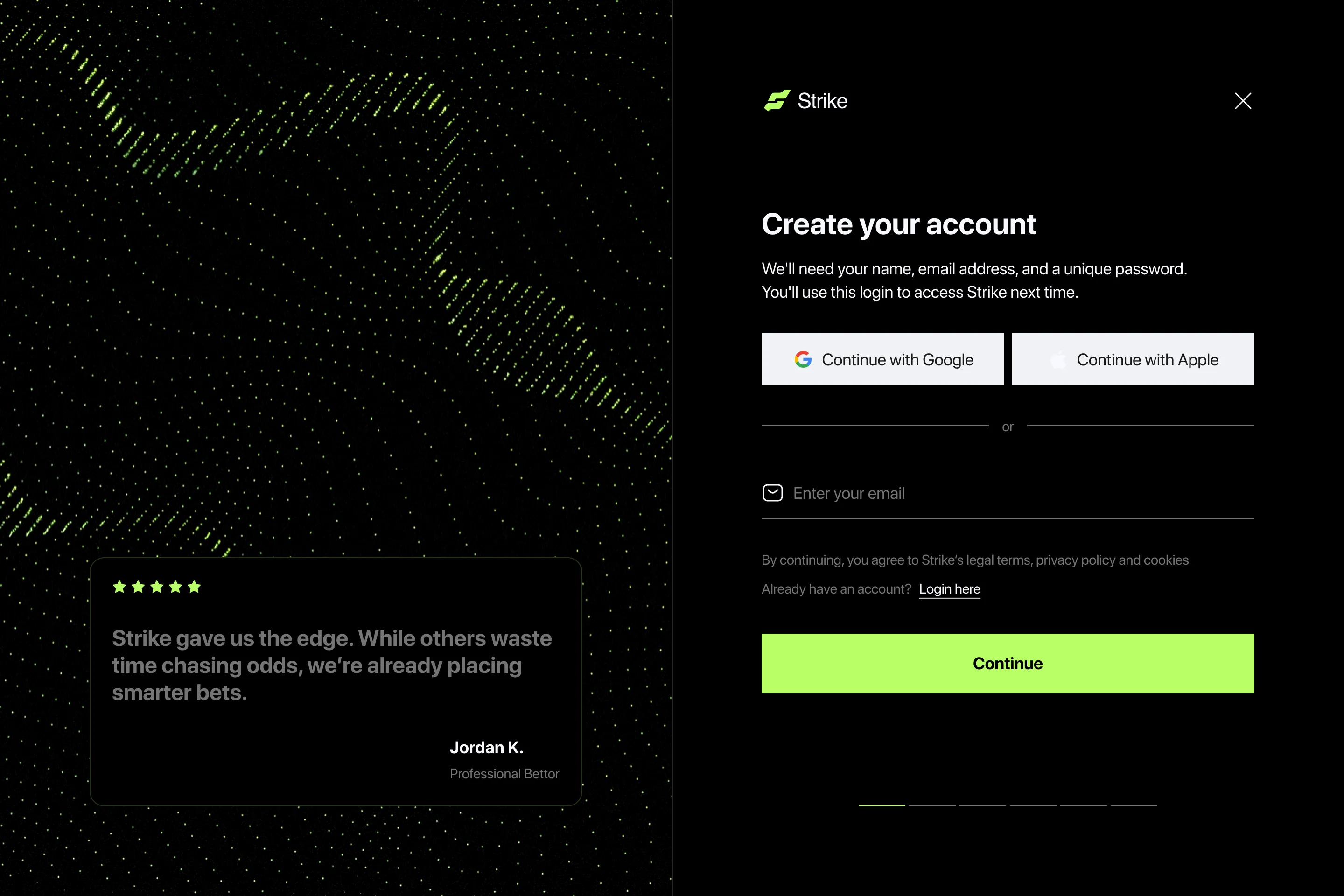
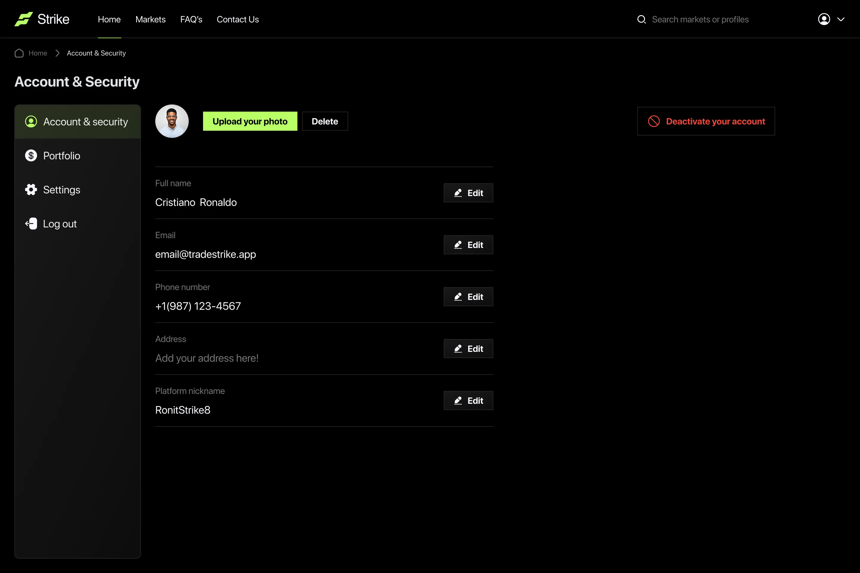
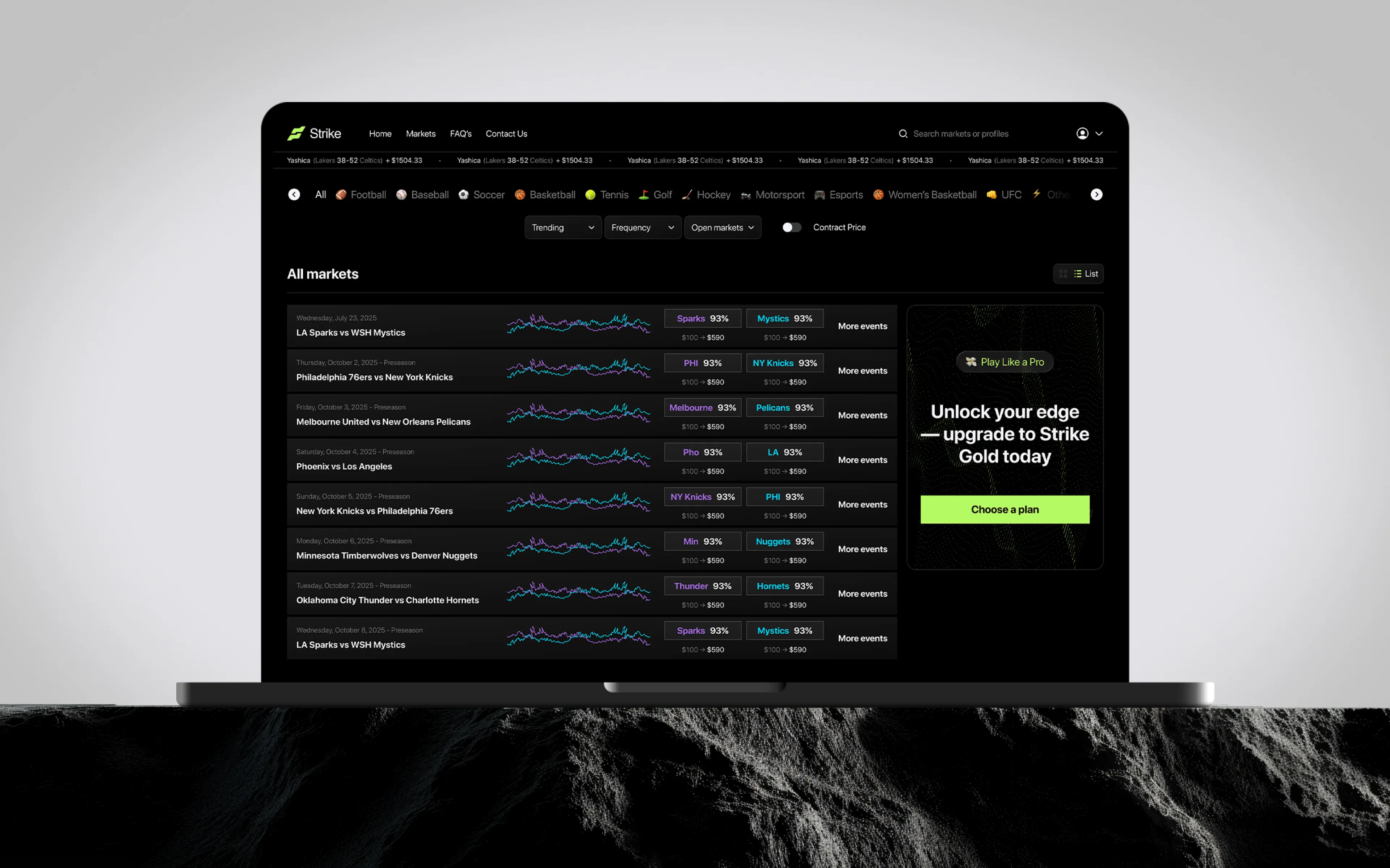
Strike
Industry: Sports Trading Platform
Strike reimagines how fans interact with sports. Instead of simply watching games or placing bets, users can trade event outcomes as market assets — buying and selling predictions in real time.
Our task was to build a digital product that merges the logic of trading with the emotions of fandom. We designed a high-contrast dark UI with dynamic data blocks, clear hierarchy, and micro-interactions that make complex trading flows feel effortless.
The interface architecture balances financial clarity and game-like excitement:
- Modular dashboards for instant market overview
- Simplified charts for live event dynamics
- Gamified feedback through motion and color shifts
- Responsive layout ensuring consistency across devices
The result: a platform that looks fast, feels transparent, and keeps users engaged for hours — not just seconds.
%20-%20Boxing.webp)
.webp)
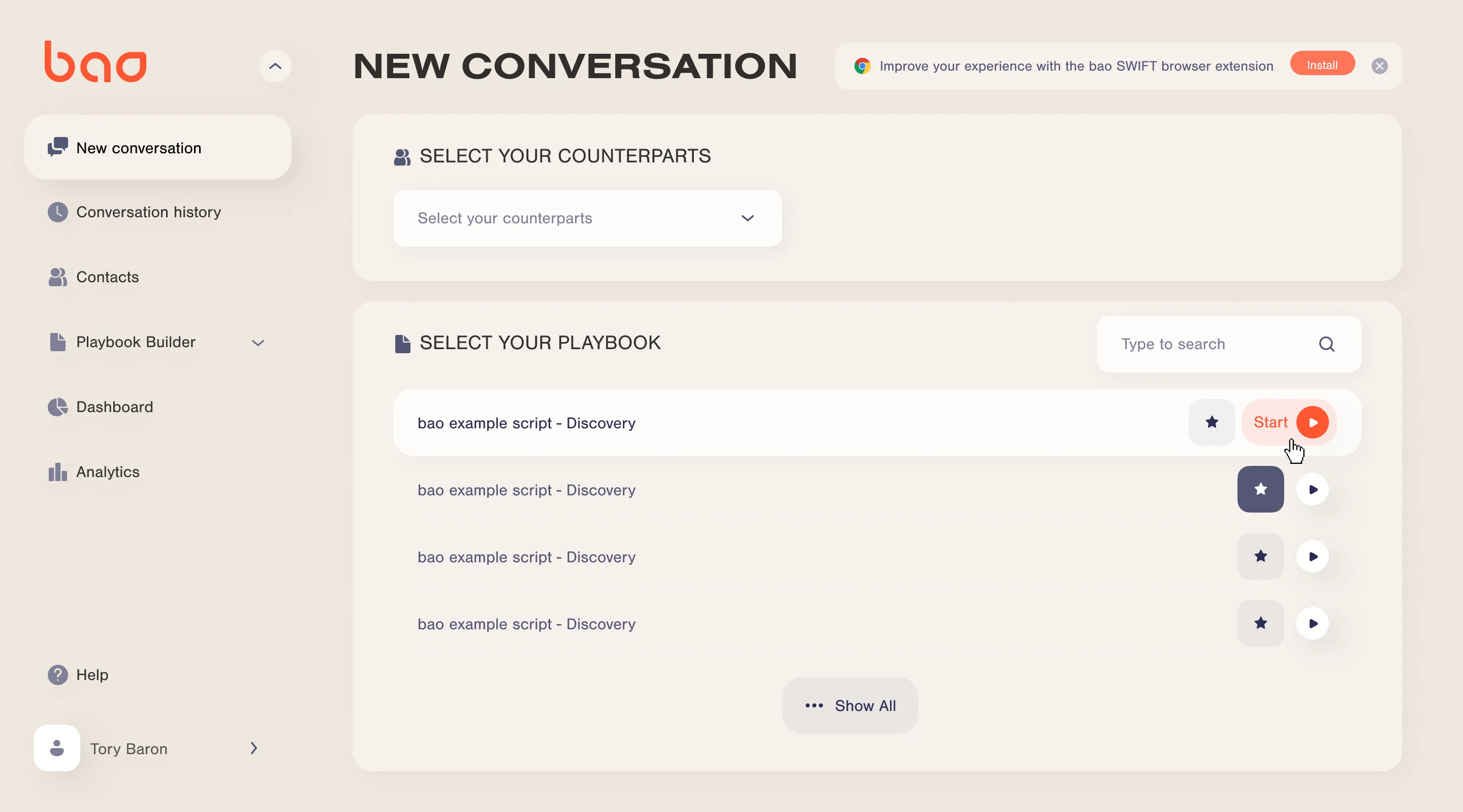
Bao Solution
Industry: SaaS
Bao is an AI-powered co-pilot that helps sales teams master every conversation — from cold calls to CRM updates. Our task was to rethink how users interact with data-heavy workflows and turn them into a clear, guided experience.
We focused on designing dashboards and playbook builder interfaces that deliver structure without friction. Each screen was crafted to keep users in flow: intuitive navigation, light and balanced visuals, and functional hierarchy that supports quick decision-making during live conversations.
Design highlights:
- Guided interaction: logical flow for creating and using playbooks in real time
- Information calmness: soft color palette and depth through layering instead of contrast overload
- Consistency: modular components for scalable SaaS architecture
- User focus: minimal distractions, maximized clarity for multitasking environments
The result — a UI that feels effortless, human, and intelligent — fully aligned with Bao’s vision of making AI support feel like a natural part of the sales workflow.


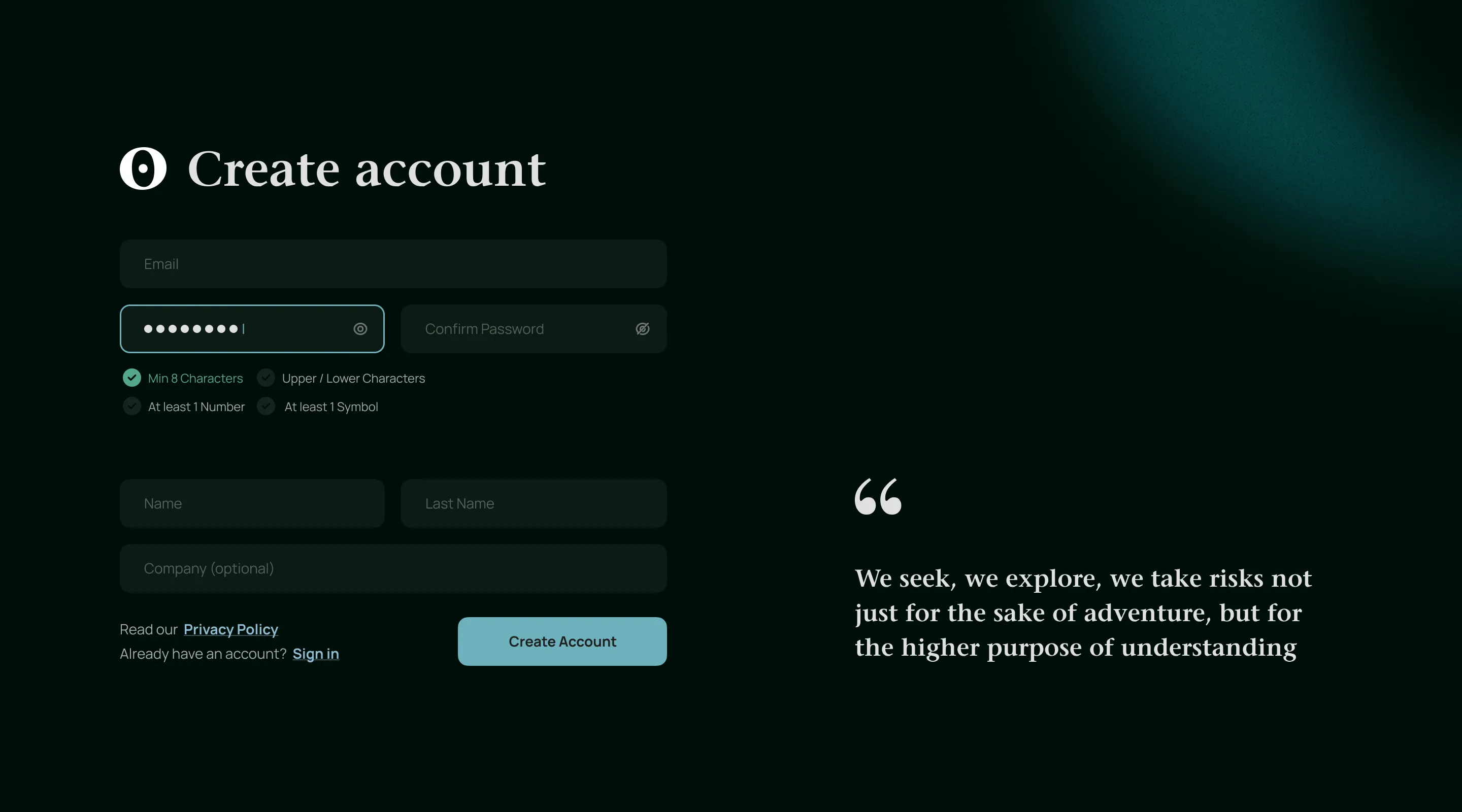
Orus on-chain analytic system
Industry: Fintech
Orus is a large-scale on-chain analytics platform built for traders, data scientists, and analysts working in the crypto market. Inspired by Bloomberg Terminal, it brings structure, clarity, and usability to a world where data is open but chaotic.
Our mission was to design a system that makes on-chain data readable, interactive, and actionable. The UX architecture was built around user adaptability — from newcomers to professional analysts — ensuring a fast perception of data and logical navigation through dashboards, graphs, and real-time analytics.
We focused on three pillars:
- Command-line interaction for lightning-fast navigation and data queries.
- Modular dashboards that users can build, customize, and save for different tasks.
- Humanized visualization — graphs and color systems designed for legibility, avoiding the aggressive palettes typical in crypto products.
Throughout the process, we conducted deep competitor and user feedback analysis, transforming the industry’s weaknesses into Orus’ advantages: flexible filters, intuitive graph control, clear labeling, and modular layouts that scale.
The result — a sophisticated analytics platform that merges complex fintech logic with effortless UX. Orus redefines how professionals interact with blockchain data: no noise, just insight.

.webp)
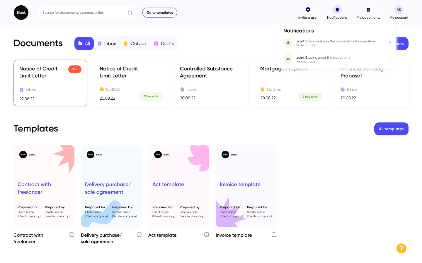
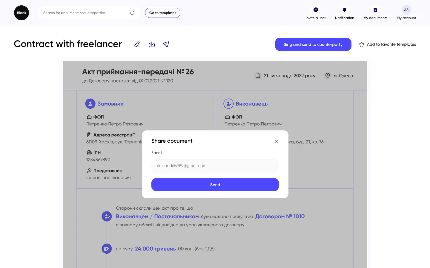
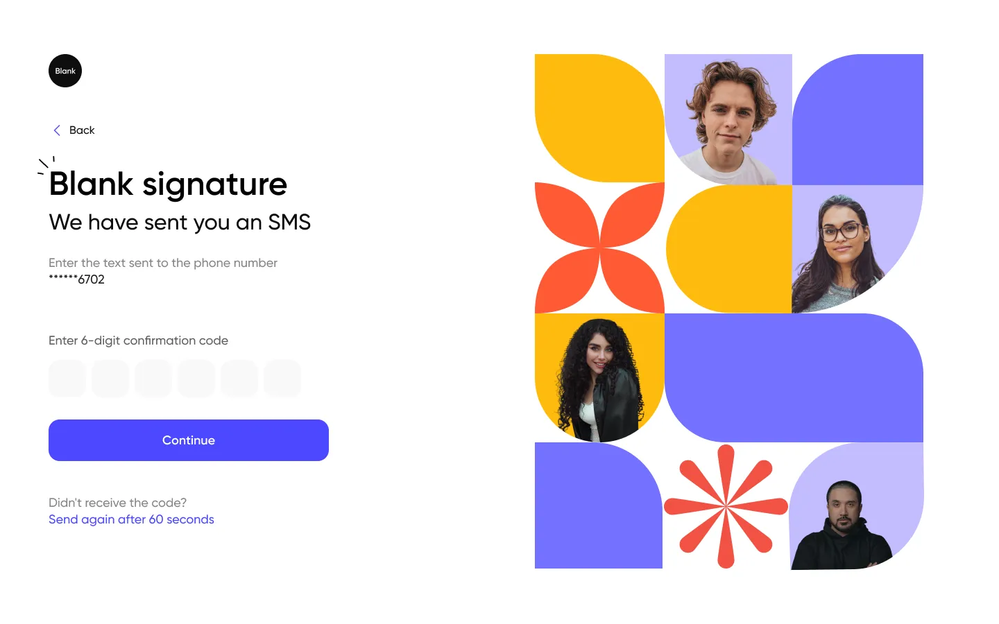
Blank
Industry: LegalTech / SaaS
Blank is a digital platform that rethinks how legal professionals manage and create documents. Designed for corporate clients, it turns complex workflows into a clear, intuitive process.
Our goal was to make legal work feel more human. We focused on building a UX that reduces friction — from document creation and review to team collaboration — while keeping the interface calm, structured, and professional.
Key design principles:
- Visual hierarchy & focus: clean structure that guides users through multi-step legal processes.
- Functional transparency: dashboards and document lists that highlight the essentials without clutter.
- Tone of trust: neutral palette, subtle typography, and calm contrasts that evoke reliability and clarity.
- Scalability: a flexible design system supporting multiple user roles and workflows.
The result is a legal tech platform that feels light and effortless, yet powerful enough to handle complex document ecosystems. Blank shows how thoughtful design can bring empathy and efficiency into a traditionally rigid domain.
.webp)
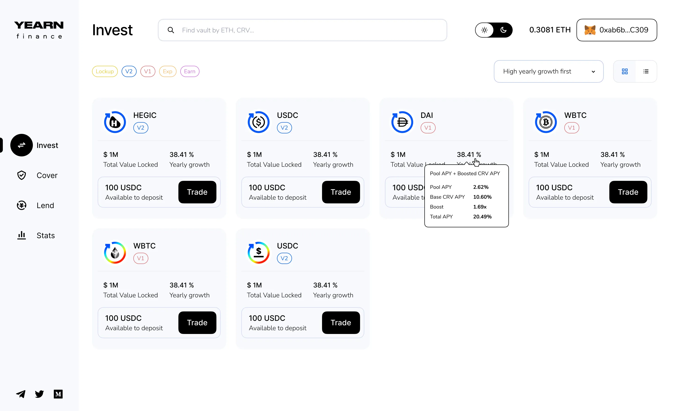
Yearn Finance
Industry: Fintech
Yearn.finance is a suite of decentralized protocols built on Ethereum that enables users to optimize returns on their crypto assets through automated lending, staking, and trading strategies.
Our challenge was to design the interface of this complex ecosystem — where multiple protocols, tokens, and yield strategies converge — and make it intuitive, structured, and visually coherent.
We focused on simplifying interactions without compromising depth. The new design system emphasizes data transparency, accessibility, and trust, balancing the technical nature of DeFi with a clean and modern UI.
Key design directions:
- Clear portfolio logic for tracking vaults, pools, and yields at a glance
- Consistent visual hierarchy to help users navigate between protocols with ease
- Data-first dashboards using minimalist visual cues for complex analytics
- Flexible modular components ensuring scalability across integrations and new features
The result — a DeFi experience that feels human and navigable. Yearn’s interface transforms the mechanics of decentralized finance into an understandable, empowering experience for both experts and newcomers.
.webp)

Designing a web application means working with logic as much as with visuals. Every decision shapes how business goals turn into actions, how users move through data, and how the product performs in real use. The best interfaces don’t try to impress — they make the system feel natural and reliable. At Obriy Design Büro, we see design as part of business logic. It’s what turns complex workflows into clear structures and helps products grow through clarity, not complexity.